Discussion:
[Matplotlib-users] Plot : Too many ticks on X axe
manik971
2015-07-08 12:49:26 UTC
Permalink
Hello,

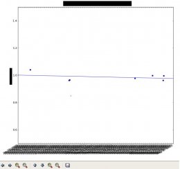
The first loaded plot have too many ticks on X axe (see image01).
<Loading Image...>
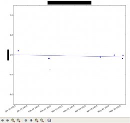
If I use the zoom action on X axe, the plot is now well loaded.
<Loading Image...>
Can you give me some advise where I can search because The Plot constructor
parameters seems good.

Thank you for your help.
Manuel


--
View this message in context: http://matplotlib.1069221.n5.nabble.com/Plot-Too-many-ticks-on-X-axe-tp45893.html
Sent from the matplotlib - users mailing list archive at Nabble.com.
manik971
2015-07-08 13:15:15 UTC
Permalink
<code>
date_range = (735599.0, 735745.0)
x = (735610.5, 735647.0, 735647.5, 735648.5, 735669.0, 735699.0, 735701.5,
735702.5, 735709.5, 735725.5, 735728.5, 735735.5, 735736.0)
y = (227891.25361545716, 205090.4880046467, 208352.59317388065,
175462.99296699322, 98209.836461969651, 275063.37219361769,
219456.93600708069, 230731.12613806152, 209043.19805037521,
218297.51486296533, 208036.88967207001, 206311.71988471842,
216036.56824433553)
y0 = 218206.79192
x_after = (735610.5, 735647.0, 735647.5, 735701.5, 735702.5, 735709.5,
735725.5, 735728.5, 735735.5, 735736.0)
y_after = (227891.25361545716, 205090.4880046467, 208352.59317388065,
219456.93600708069, 230731.12613806152, 209043.19805037521,
218297.51486296533, 208036.88967207001, 206311.71988471842,
216036.56824433553)
ax.plot_date(x, numpy.array(y) / y0, color='r', xdate=True, marker='x')
linex = -39.1175584541
liney = 28993493.5251

ax.set_xlim(date_range)
steps = list(ax.get_xlim())
steps.append(steps[-1] + 2)
steps = [steps[0] - 2] + steps
ax.plot(steps, numpy.array([linex * a + liney for a in steps]) / y0,
color='b')
</code>


--
View this message in context: http://matplotlib.1069221.n5.nabble.com/Plot-Too-many-ticks-on-X-axe-tp45893p45894.html
Sent from the matplotlib - users mailing list archive at Nabble.com.
Benjamin Root
2015-07-08 15:36:22 UTC
Permalink
Your code example is incomplete. Even if I add in the typical imports and
"fig, ax = plt.subplots()" and "plt.show()", The x tick labels aren't
rotated, and I certainly don't have too many tick labels. Could you provide
a complete working example that demonstrate the problem?

Ben Root
Post by manik971
<code>
date_range = (735599.0, 735745.0)
x = (735610.5, 735647.0, 735647.5, 735648.5, 735669.0, 735699.0, 735701.5,
735702.5, 735709.5, 735725.5, 735728.5, 735735.5, 735736.0)
y = (227891.25361545716, 205090.4880046467, 208352.59317388065,
175462.99296699322, 98209.836461969651, 275063.37219361769,
219456.93600708069, 230731.12613806152, 209043.19805037521,
218297.51486296533, 208036.88967207001, 206311.71988471842,
216036.56824433553)
y0 = 218206.79192
x_after = (735610.5, 735647.0, 735647.5, 735701.5, 735702.5, 735709.5,
735725.5, 735728.5, 735735.5, 735736.0)
y_after = (227891.25361545716, 205090.4880046467, 208352.59317388065,
219456.93600708069, 230731.12613806152, 209043.19805037521,
218297.51486296533, 208036.88967207001, 206311.71988471842,
216036.56824433553)
ax.plot_date(x, numpy.array(y) / y0, color='r', xdate=True, marker='x')
linex = -39.1175584541
liney = 28993493.5251
ax.set_xlim(date_range)
steps = list(ax.get_xlim())
steps.append(steps[-1] + 2)
steps = [steps[0] - 2] + steps
ax.plot(steps, numpy.array([linex * a + liney for a in steps]) / y0,
color='b')
</code>
--
http://matplotlib.1069221.n5.nabble.com/Plot-Too-many-ticks-on-X-axe-tp45893p45894.html
Sent from the matplotlib - users mailing list archive at Nabble.com.
------------------------------------------------------------------------------
Don't Limit Your Business. Reach for the Cloud.
GigeNET's Cloud Solutions provide you with the tools and support that
you need to offload your IT needs and focus on growing your business.
Configured For All Businesses. Start Your Cloud Today.
https://www.gigenetcloud.com/
_______________________________________________
Matplotlib-users mailing list
https://lists.sourceforge.net/lists/listinfo/matplotlib-users
Loading...